How to do accordions effect on table rows with Bootstrap? We will see that using a HTML table to make a table … is not a good idea!
Goal
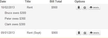
Make a table where each row is clickable to show a hidden sub-content (left side) and / or to navigate with clickable buttons (right).

bootstrap collapse component stylish buttons We must therefore integrate bootstrap collapse component and stylish buttons.
Bad Idea with table
Step 1 : table
it is the one bootstrap offers us a simple table Nothing to say is the most logical solution, because it is the one bootstrap offers us a simple table.
<tr>
    <td>1</td>
    <td>Mark</td>
    <td>Otto</td>
    <td>@mdo</td>
</tr>
<tr>
    <td>2</td>
    <td>Jacob</td>
    <td>Thornton</td>
    <td>@fat</td>
</tr>

Step 2 : table + collapse
bootstrap the doc with only data-target and collapse You must use the bootstrap the doc with only data-target and collapse.
Problem: The collapse does not work with a TR tag for target.
Solution: Create a DIV in a sub-TR (optional: add CSS to hide the permanent residual margin/padding of the hidden/collapsed line).
<tr class="accordion-toggle"  data-toggle="collapse" data-target="#collapseOne">
    <td>1</td>
    <td>Mark</td>
    <td>Otto</td>
    <td>@mdo</td>
</tr>
<tr>
    <td></td>
    <td colspan="3">
        <div id="collapseOne" class="collapse in">
            Details 1 <br/>
            Details 2 <br/>
            Details 3 <br/>
        </div>
    </td>
</tr>

Step 3 : table + collapse + buttons
Problem: a click on a button causes a side effect of expand/collapse the container row. It’s bad when you click for a new tab/window on the details button to displays, because it will activate the accordion effect on the current row (example: click on edit).
Solution: you must prevent the expand/collapse from triggering when a button is clicked. It is therefore necessary to assign the click to expand each cell rather than on the TD TR tags.
It works BUT JavaScript lags on expanding/collapsing when there are dozens of roww and sub-rows on the page and there are duplicate code.
<tr class="accordion-toggle"  >
    <td data-toggle="collapse" data-target="#collapseTwo">1</td>
    <td data-toggle="collapse" data-target="#collapseTwo">Mark</td>
    <td data-toggle="collapse" data-target="#collapseTwo">Otto</td>
    <td data-toggle="collapse" data-target="#collapseTwo">@mdo</td>
    <td><a class="btn btn-primary" href="https://www.google.com/"><i class="icon-search icon-white"></i></a></td>
</tr>
<tr>
    <td></td>
    <td colspan="4">
        <div id="collapseTwo" class="collapse in">
            - Details 1 <br/>
            - Details 2 <br/>
            - Details 3 <br/>
        </div>
    </td>
</tr>

Better Idea with div
Step 1 : div
Bootstrap grid system You must use the Bootstrap grid system.
Problem: table style is lost.
Solution: (optional) You must duplicate the CSS if you will get the same rendering as before (top row border, cell width, header bold).
<div class="row-fluid" >
    <div class="span2">1</div>
    <div class="span2">Mark</div>
    <div class="span2">Otto</div>
    <div class="span2">@mdo</div>
</div>

Step 2 : div + collapse
(same solution table and collapse)
Problem: The cursor’s shape does not change when being over the clickable row (“hand” icon expected here).
Solution: (optional) use a personal style or re-use the class accordion-toggle on the collapsable DIV.
<div class="row-fluid" data-toggle="collapse" data-target="#collapseTwo">
    <div class="span1">1</div>
    <div class="span3">Mark</div>
    <div class="span3">Otto</div>
    <div class="span3">@mdo</div>
</div>
<div id="collapseTwo" class="row-fluid collapse in">
    <div class="span1"></div>
    <div class="span9">
        Details 1 <br/>
        Details 2 <br/>
        Details 3 <br/>
    </div>
</div>

Step 3 : div + collapse + buttons
(same solution collapse + table + buttons)
Problem: Adding buttons also add conflicts with the collapse/expand effect.
Solution: remove the button form the DIV toggler.
Solution
<div class="row-fluid" >
    <div class="accordion-toggle" data-toggle="collapse" data-target="#collapseThree">
        <div class="span1">1</div>
        <div class="span3">Mark</div>
        <div class="span3">Otto</div>
        <div class="span3">@mdo</div>
    </div>
    <div class="span1">
        <button type="button" class="btn btn-primary"><i class="icon-search icon-white"></i></button>
    </div>
</div>
<div id="collapseThree" class="row-fluid collapse in">
    <div class="span1"></div>
    <div class="span9">
        Details 1 <br/>
        Details 2 <br/>
        Details 3 <br/>
    </div>
</div>
#
Conclusion
I currently use the DIV version. With TABLE, fhe final page was not reactive enough, the source code was duplicated, and there were a lot of bugs/maintenance and technical solution TABLE was not always understandable, even with the doc bootstrap support.
COLLAPSABLE TABLE
- Pro : defaut bootstrap CSS style
- Con : it’s a hack, performance issues, code duplication
COLLAPSABLE DIV
- Pro : responsive, fast, reliable
- Con : custom style for cursor and TABLE
Sources
http://github.com/damienfremont/blog/tree/master/20141216-bootstrap-collapsable_table http://github.com/damienfremont/blog/tree/master/20141216-bootstrap-collapsable_table
References
http://getbootstrap.com/2.3.2/ http://getbootstrap.com/2.3.2/
http://getbootstrap.com/2.3.2/base-css.html http://getbootstrap.com/2.3.2/base-css.html
http://getbootstrap.com/2.3.2/javascript.html http://getbootstrap.com/2.3.2/javascript.html
http://getbootstrap.com/2.3.2/scaffolding.html http://getbootstrap.com/2.3.2/scaffolding.html
http://getbootstrap.com/2.3.2/components.html http://getbootstrap.com/2.3.2/components.html
Origin
https://damienfremont.com/2014/12/19/how-to-expandcollapse-table-rows-with-bootstrap


